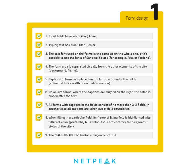
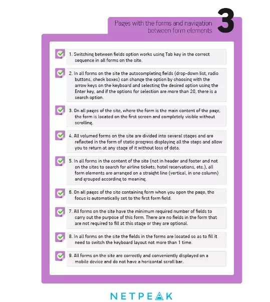
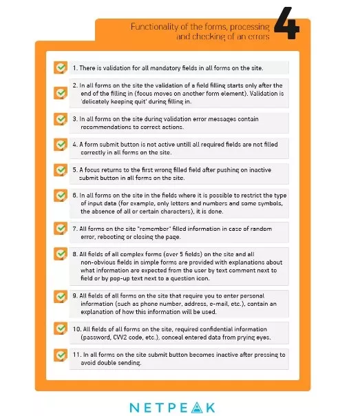
One of the key marketing problems all online stores try to cope with is that about 70-80% of all users usually leave website at the stage of making an order. The majority of mistakes in the ordering forms are extremely trivial, and we have already given some precise advice on how to prevent it. However, every day we see the order website forms that consist of many fields and look really boring. Because of that we decided to show the detailed checklist for every type of order forms for E-commerce sites. You can show this post to all the design and usability rules violators.
In the “Western world” countries, the issue of the design culture form development was solved with help of contests, such as Web Form Design Awards and Ecommerce Design Awards by Shopify. Not only the best participants can take top places. For example, this project was recognized as one of the ugliest Ecommerce sites in UK. Unfortunately, such voting systems are not presented in our country.

One of the top usability specialists Christian Holst recommends to avoid such buttons as “Next”, “Preview” and especially – “Confirm” (if it refers to the confirmation of sending the forms’ data) when creating a form. More than 50% of participants of Holst experiment haven't even thought about pressing the button in case there is a second CTA on the site page.
Specialists don’t recommend to add a separate field with the button for promo code input (gift coupon). The great number of users like to “google” promo code and don’t come back no more on the site. So it’s easier just to show the question ( “Do you have gift coupon?”) with active link and pop-up input field.
The checklist version without editorial comments is presented on our Pinterest page. Besides thinking about quality design of order forms itis also necessary to think about quality setup of advertising campaign for attraction of potential customers. Do you want to spend money with benefits? Read step-by-step instruction on set-up of contextual advertising.

 2
2
 0
0
 2
2
Related Articles
2026 Marketing Budget Benchmarks for Movers in the US
In 2026, most moving companies should consider putting 5% to 12% of their yearly revenue into marketing.
How Many People Search for Movers Each Month in the US? (2026 Data)
2026 US moving search data: monthly trends, peak season, top keywords & state demand. Data-backed insights for moving company SEO strategy.
Amazon FBA vs FBM Explained: How Pet and Beauty Brands Should Choose Their Fulfillment Strategy in 2026?
Choosing between FBA and FBM? Discover the best fulfillment strategy for pet and beauty brands based on product type, fees, and profitability.