

Oops! Something went wrong while submitting the form.

Kateryna Holubka
Head of Sales of Netpeak International


Camotec's customer base splits in two: civilian outdoor enthusiasts with time to browse, and military personnel ordering fast under real constraints. One checkout flow. Two very different users. And a purchase conversion rate sitting at 1.22%, well below what the traffic volume should have been producing. User feedback collected via the thank-you page pointed to the same funnel stages every time: the product card, the cart, and checkout.
The company partnered with Netpeak for an external perspective on the user experience: a structured, hypothesis-driven process that could identify where the journey was breaking down for each audience and fix it without radical changes or risk to current sales.
Increase purchase conversion across the full funnel (from product card to completed order) through targeted UX improvements grounded in real user behavior data.


Start with direct feedback: thank-you page responses from real buyers gave us the qualitative layer that session data alone couldn't; what users were thinking at the moments they hesitated.

Build hypotheses from behavior: Clarity recordings, heatmaps and scroll maps identified the exact moments users stalled, each one becoming a testable hypothesis before any change went live.

Sequence changes deliberately: one page per month, so every result could be attributed to a specific decision rather than lost in a simultaneous rollout.
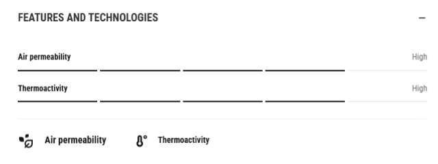
Restructured the "Features" block into a condensed format, moving key product information higher on the page and removing the secondary content pulling attention away from the purchase decision.
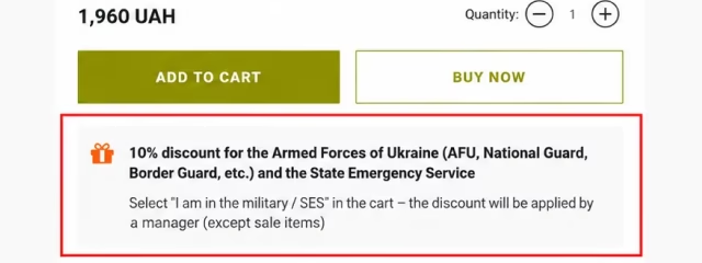
Added a clear military discount block right under the price, detailing conditions and eligibility at the product selection stage before users reached the cart.
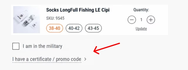
Reduced call center inquiries about discount activation by making the discount scenario visible and self-explanatory from the product card onward.

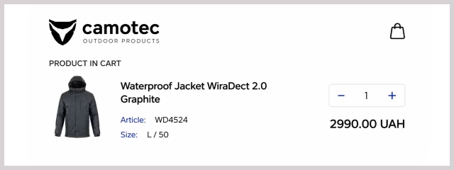
Hidden the promo code field and reduced its visual priority, cutting average time spent on it from 8 minutes to under 4 and click rate from 1.68% to 1.37%, so users moved through the cart faster and completed checkout more often.

Built an "Expected Dispatch" block showing estimated shipping timing based on order time, turning an open question into a concrete answer before users reached checkout.

Added a tooltip explaining the processing and dispatch schedule, reducing uncertainty at the moment most likely to cause users to pause or compare alternatives.
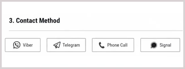
Added a "Choose Communication Method" block at checkout with Viber, Telegram, Signal, and phone options, removing the call confirmation requirement that was stopping military and volunteer buyers at the final step.
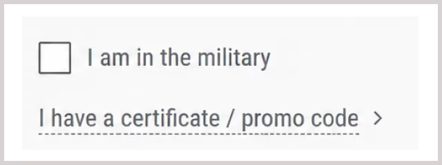
Added an "I'm Military" option to the checkout flow, with the discount applied by the manager during order confirmation. The option became the fifth most clicked element across the entire checkout in Clarity, confirming that the discount scenario was now clear and didn't interrupt the purchase path.
Recommended increasing font sizes across the mobile checkout to meet Apple and Google readability guidelines, reducing errors and drop-offs for users completing orders on mobile devices in the field.