How to Increase Purchase Conversions by 26% for a Gear Manufacturer with Minor UX Changes
Camotec, a manufacturer of tactical gear, had plenty of interested shoppers, but they didn’t complete their purchases. Turns out, the toughest obstacle was hesitation. Thanks to minor UX changes, they achieved a +26% increase in overall purchase conversion.
Sometimes your biggest conversion killer is the user experience. Visitors come to the site, browse products, but on the path to purchase, doubts arise. Small bits of friction prevent them from completing the order.
Camotec, a manufacturer of tactical gear, came to us with a familiar problem. In this case study, we'll show you:
-
How we uncovered the real conversion killers using analytics and customer feedback.
-
Which moments mattered most on the path to purchase.
-
The UX improvements that increased purchase conversions by 26% year over year — without redesigning the entire site or launching new products.
Meet the Brand Behind the Mission
Camotec is a Ukrainian manufacturer that designs and produces functional apparel — from tactical gear to outdoor clothing. The brand serves both military and civilian customers, selling through its own e-commerce store as well as physical retail locations.
Goals of the Collaboration
Our priorities were to:
-
Help more shoppers add products to their cart by making product selection simpler and information easier to understand for different customer groups.
-
Reduce cart abandonment with a faster and more intuitive checkout experience.
-
Increase purchase conversions — the metric that matters most.
-
Create a cleaner, more user-friendly interface that works equally well for first-time visitors and returning customers.
Camotec came to us when the next stage of growth wasn't about adding more products or generating more demand. They needed to make their website more effective.
The products were battle-ready. The checkout needed a little backup.
People were finding the online store and exploring the catalog, but too many were dropping off before checkout. The key question was at which stage of the purchase journey users were leaving and why.
Camotec needed a fresh pair of eyes, a structured way to test what was actually holding customers back, and results they could measure — without radical changes or risks to sales.
Based on these goals, we focused on making the buying journey smoother from the first click to the final checkout.
The Roadmap to Higher Conversions
Here are the main steps:
- User Behavior Analysis
- Finding the Biggest Conversion Opportunities
- UX Solutions to Improve Key Pages
In the tactical apparel and gear market, customers often make decisions quickly. If they have to stop and wonder about delivery, discounts, or how to get help, there's a good chance they'll stop shopping too.
Instead of optimizing isolated buttons or banners, we looked at the entire buying journey. Our goal was to remove the small moments of doubt that appeared between choosing a product and completing the purchase.
Step 1. User Behavior Analysis
We started with the data to understand how people were really using the website. Here's what we did:
-
Analyzed website performance and user behavior in Looker.
-
Configured additional events to capture missing interactions.
-
Mapped every step of the checkout journey, including how users interacted with each field in the order form.
This allowed us to recreate a real-world user scenario and helped us pinpoint exactly where shoppers started to hesitate, got stuck, or left the site altogether.
Session recordings in Microsoft Clarity, heatmaps, scroll maps, and interaction time maps show exactly how users behave on the pages. These insights gave us priority hypotheses that directly impacted the speed, accuracy, and clarity of the user journey.
Numbers told us where customers were dropping off. Customer feedback told us why.
To complete the picture, we paired analytics with real user feedback collected through a survey on the thank-you page. Customers shared what confused them, what slowed them down, and what almost stopped them from placing an order.
With those insights in hand, we moved on to the next stage.
Step 2. Finding the Biggest Conversion Opportunities
Using everything we learned from the data and customer feedback, we built and prioritized a list of CRO hypotheses. Our focus was on changes that could make the biggest difference with the least disruption.
Specifically, we:
-
Identified the biggest friction points across the product page, add-to-cart flow, and checkout.
-
Prioritized the issues that had the greatest impact on purchasing decisions.
-
Created a testing roadmap based on a "one page, one month" approach, allowing us to measure the impact of each change before moving on to the next.
Priority was given to hypotheses that made the buying experience faster, clearer, and more predictable.
Step 3. UX Solutions to Improve Key Pages
Once the key opportunities had been identified and prioritized, it was time to turn those insights into action.
Placing an Order: Flexible Communication Options
After analyzing the feedback, we noticed a clear pattern.
Some users either don't want to or can't communicate by phone.
This is especially important for military personnel and volunteers, who may have limited connectivity or only a short window to place an order. Giving customers just one way to communicate can create unnecessary delays and lead to abandoned purchases.
What we changed: During checkout, we added a separate “Choose a Communication Method” section with options for messaging apps or phone calls.
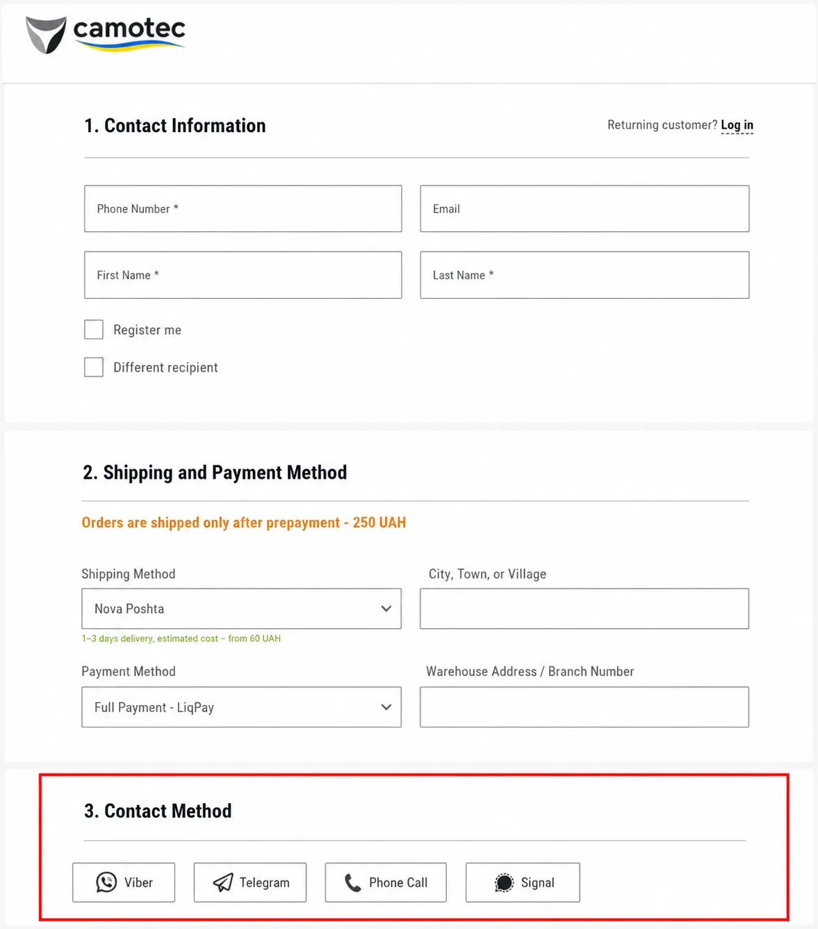
The update quickly proved its value. According to Microsoft Clarity, 5.10% of visitors interacted with the contact method selector, showing that the feature was easy to find, simple to use, and fit naturally into the checkout flow.
Result: More users were willing to share their contact information, while the risk of losing orders because of an inconvenient communication method was significantly lower.
Checkout: Military Discount
The discount process for military members was unclear. Users saw a mention of it on a banner, but didn’t understand how to apply it.
We suggested adding the military status option directly to the checkout. The discount would be applied by a manager during confirmation.
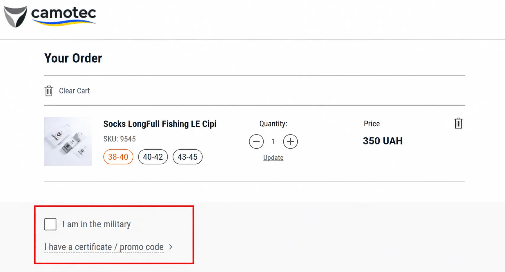
Result: According to Microsoft Clarity, this feature is now the fifth most-clicked element on the page.
To improve the discount's visibility and clarify how it works, we suggested adding an explanatory block below the price with a clear description of the discount terms.
Result: Clearer discount information gave shoppers one less thing to wonder about before buying. Customers spent more time engaging with the section; it attracted more attention, and fewer people needed to contact support to ask how the discount worked.
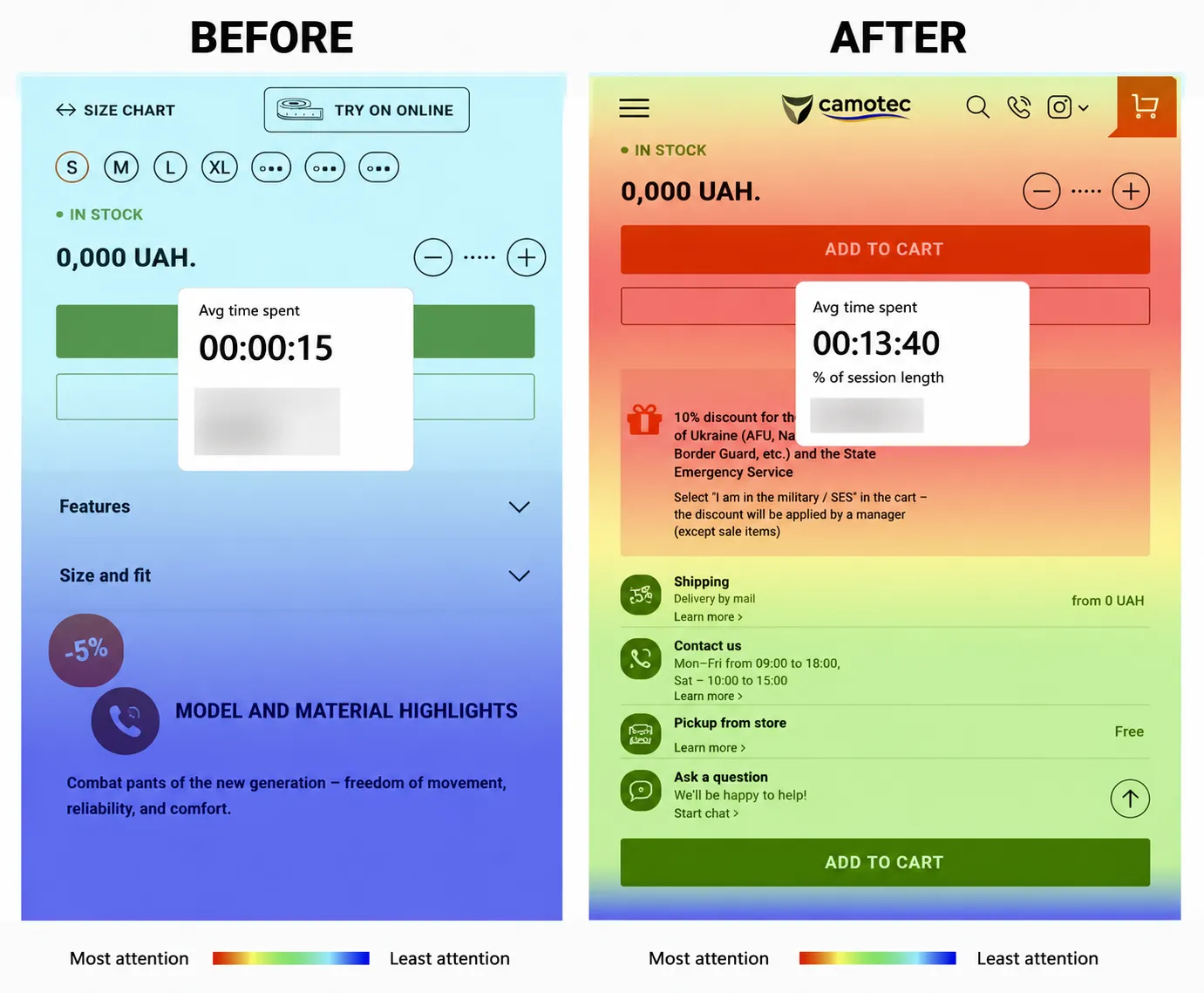
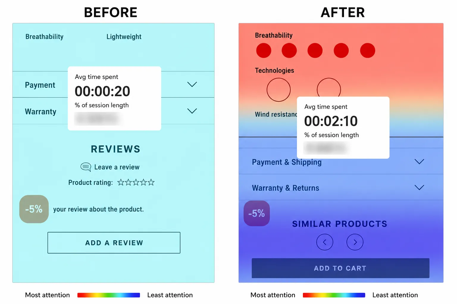
Product Card: Optimization of the “Features” Section
The “Model and Material Features” section occupied the top portion of the product card. As a result, users interacted less with the information sections further down the page.
What we changed: Updated the "Features" section by turning it into collapsible accordions, making key information easier to find while keeping additional details neatly tucked away until users needed them.
Result:
-
Time spent interacting with important information sections increased from ~20 seconds to over 2 minutes;
-
YoY growth in the conversion rate for adding items to the cart: +21.3%.
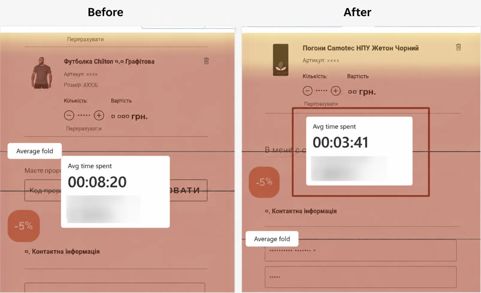
Checkout: We hid the Promo Code Field to Reduce Frustration
The promo code field was keeping users on the page, and they were likely leaving to look for discounts off-site.
What we changed: We hid the promo code field and reduced its prominence.
Result:
-
The average time spent in this section went from 8 to 3 minutes, and the click-through rate dropped from 1.68% to 1.37%;
-
Users focused less on searching for promo codes and completed their orders faster.
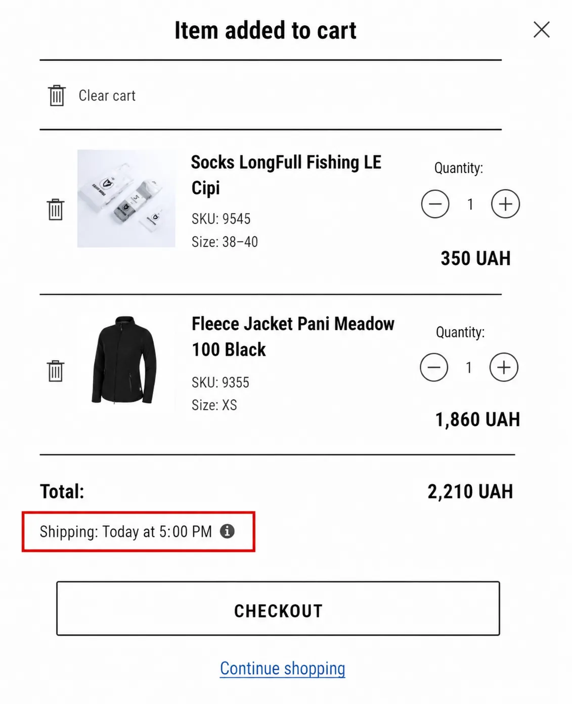
Shopping Cart: Added Expected Shipping Date
For military personnel and volunteers, delivery speed matters. If it's unclear when an item will arrive, shoppers are more likely to keep looking or put off buying altogether.
What we changed: Added an “Expected Shipping” section to the shopping cart, with logic that updates based on the time of checkout. It was placed next to the total amount or below the “Checkout” button.
To build trust at checkout, we also recommended adding a tooltip explaining how order processing and shipping work.
Result:
-
Clearer shipping expectations gave shoppers more confidence and a greater sense of control at checkout.
-
The conversion rate from cart to checkout increased by 21.3% year over year (2024–2025).
Mobile Version: Improved Readability
Some of the text and labels were too small, so it was difficult to read and fill out forms, especially while on the go or in the field.
What we changed: Increased font sizes and aligned them with Apple and Google’s guidelines to ensure readability without zooming.
Result:
-
Improved user experience on all devices.
-
Fewer errors and drop-offs on mobile devices.
Results and Business Insights
To measure the impact, we compared key performance metrics from 2024 and 2025:
-
+21.3% increase in add-to-cart actions. Clearer product pages, better-organized product information, and more visible shipping details made it easier for shoppers to make purchase decisions.
-
+6% increase in checkout-to-purchase conversion. Optimizing the checkout experience and removing friction throughout the conversion funnel helped more customers complete their orders.
-
+26% increase in overall purchase conversion. Rather than one dramatic redesign, this growth came from the combined impact of dozens of carefully tested UX improvements across the entire customer journey.
-
Improved user experience. Increasing font sizes on the mobile version, adding intuitive controls in the shopping cart (quantity counters, item removal), and providing delivery tips made browsing comfortable for users of all ages.
This case study shows that a systematic approach to user experience can significantly boost conversion rates and sales performance, even in a niche e-commerce market.
When every stage of the purchase process is built on logic, transparency, and users’ actual needs, not only do conversion rates increase, but trust in the brand as well.
Key insights:
-
The convenience and clarity of the interface directly impact conversion rates.
-
Direct feedback from users helps identify priorities.
-
Small, well-thought-out improvements in the shopping cart and during checkout can yield significant gains without changing the product lineup or business model.
What’s Next
The work doesn't stop here. The next phase of the project focuses on A/B testing the most important parts of the customer journey — from product pages to the shopping cart and checkout.
By testing improvements one at a time, it's possible to measure what truly drives customer behavior, scale the changes that work, and uncover new growth opportunities without major redesigns or adding unnecessary pressure on the development team.
Collaboration Feedback
Mykola Nedozimovany, Head of E-commerce
We chose Netpeak because they are a professional company with a proven track record and testimonials from successful businesses. Netpeak had all of this, and they understood the level of collaboration required of them. I appreciated their structured approach to work and the clarity of their actions. Everything was detailed with clear deadlines and transparency. Communication with the team was easy.
Beyond their expertise in professional matters, it was a pleasure working with them. The results of our collaboration are truly noticeable. I can confidently recommend Netpeak.
Kateryna Muzyka, UX Specialist
Working on military e-commerce instills an acute sense of responsibility for every decision. There’s no room for anything superfluous, unclear, or complicated.
I was most impressed by our partner’s team. They truly understand their target audience and consider not only sales, but also convenience, speed, and reliability. They pay close attention to detail, and they make decisions with respect for the user based on real-world scenarios, not assumptions.
As a UX specialist, I appreciate that this project recognizes the importance of design and analytics in delivering real value, not just creating a pretty picture.
We’re grateful for the trust placed in Netpeak, the openness to dialogue, and the opportunity to contribute to a meaningful product. This experience reaffirms that UX is first and foremost about people.
Project team: Danilo Minin, Head of UI/UX Department; Kateryna Muzyka, IM&UX Specialist; Olga Syvolap, Project Manager; Yelyzaveta Udod, Data Analyst.

 0
0
 0
0
 0
0
Related Articles
2026 Marketing Budget Benchmarks for Movers in the US
In 2026, most moving companies should consider putting 5% to 12% of their yearly revenue into marketing.
How Many People Search for Movers Each Month in the US? (2026 Data)
2026 US moving search data: monthly trends, peak season, top keywords & state demand. Data-backed insights for moving company SEO strategy.
Amazon FBA vs FBM Explained: How Pet and Beauty Brands Should Choose Their Fulfillment Strategy in 2026?
Choosing between FBA and FBM? Discover the best fulfillment strategy for pet and beauty brands based on product type, fees, and profitability.