
Clothing Brand UX Case Study: How We Boosted Conversion Rate by 81%
This clothing store UX case study in ecommerce showcases how targeted UX improvements can remove friction from the customer journey and increase conversions by 81%. Working with Trofim Family, a wholesale clothing, footwear, and home-goods retailer, Netpeak’s UX/CRO team analyzed the shopping experience and redesigned three critical ecommerce touchpoints: the shopping cart, checkout flow, and site search.
Each change was tested against the existing website performance baseline. The results showed significant improvements across key conversion metrics:
-
+81% increase in checkout confirmation conversion rate
-
+40% growth in cart CTA interactions
-
+150% increase in purchases among users who used site search
Wanna achieve the same results for your fashion brand? Keep reading as we will provide actionable insights for ecommerce brands looking to improve checkout UX, optimize shopping cart performance, or polish the UX design of outdated online store templates.
Fashion Clothing Case Study: Project Snapshot
Client: Trofim Family — wholesale apparel, footwear, and home-goods retailer
Service: CRO/UX-UI optimization
Timeline: January-March 2026 (baseline: Q4 2025)
Scope: Cart page, checkout flow, on-site search
Catalog size: 20,000+ SKUs, B2B and repeat-purchase audience
|
Area |
Before |
After |
Lift |
|
Checkout confirmation conversion |
11.6% |
20.9% |
+80.6% |
|
Cart CTA (“Place order”) interaction |
5.7% |
7.97% |
+40% |
|
Search-to-purchase conversion |
Baseline |
+7.58% (Jan) / +8.54% (Feb) |
+150% in searcher-to-buyer share |
|
Cash-on-delivery share |
17.6% avg |
15.8% avg |
-10.7% |
Challenges & Goals
Trofim Family had already solved the harder problem: traffic and product discovery were healthy, and the site and app were the primary sales channel for a large, frequently reordered catalog. The user experience gap sat downstream, at the moments where a browser becomes a buyer.
Before the project, the interface created friction at each stage:
-
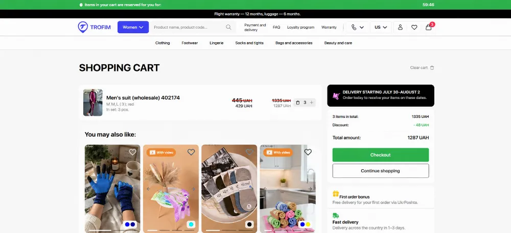
The cart's "Place order" button wasn't pinned, so it could scroll out of view.
-
There was no way to keep browsing without losing cart progress.
-
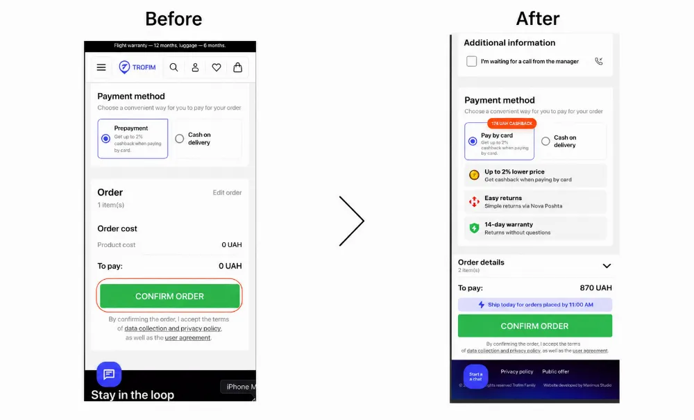
The checkout's confirm button and order total weren't fixed on screen, so shoppers lost track of the final amount.
-
Payment and cashback terms were vague, pushing hesitant buyers toward cash-on-delivery.
-
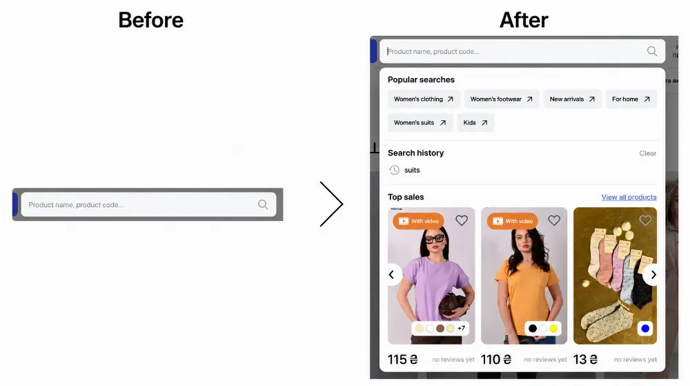
Search returned an empty box with no guidance for shoppers who didn't have an exact query, and dead-end "no results" pages with no next step.
The goals across all three initiatives for this clothing brand UX optimization were straightforward: reduce the number of exits at each step, make the primary action impossible to miss, and give every visitor a path forward, no matter whether they know exactly what they want or not.
Why does it matter? Baymard Institute's research across 50+ studies puts the average cart abandonment rate at 70.2%, and estimates that fixing solvable checkout usability issues alone can lift conversion by over 35% on large ecommerce sites.
Hence, clothing brand businesses that don’t polish the user journey risk losing on a third of potential customers just because of poor UI/UX decisions.
Results
Across the three workstreams, small, targeted interface changes outperformed adding new features in terms of boosting user experience:
-
Checkout confirmation conversion nearly doubled, from 11.6% to 20.9%.
-
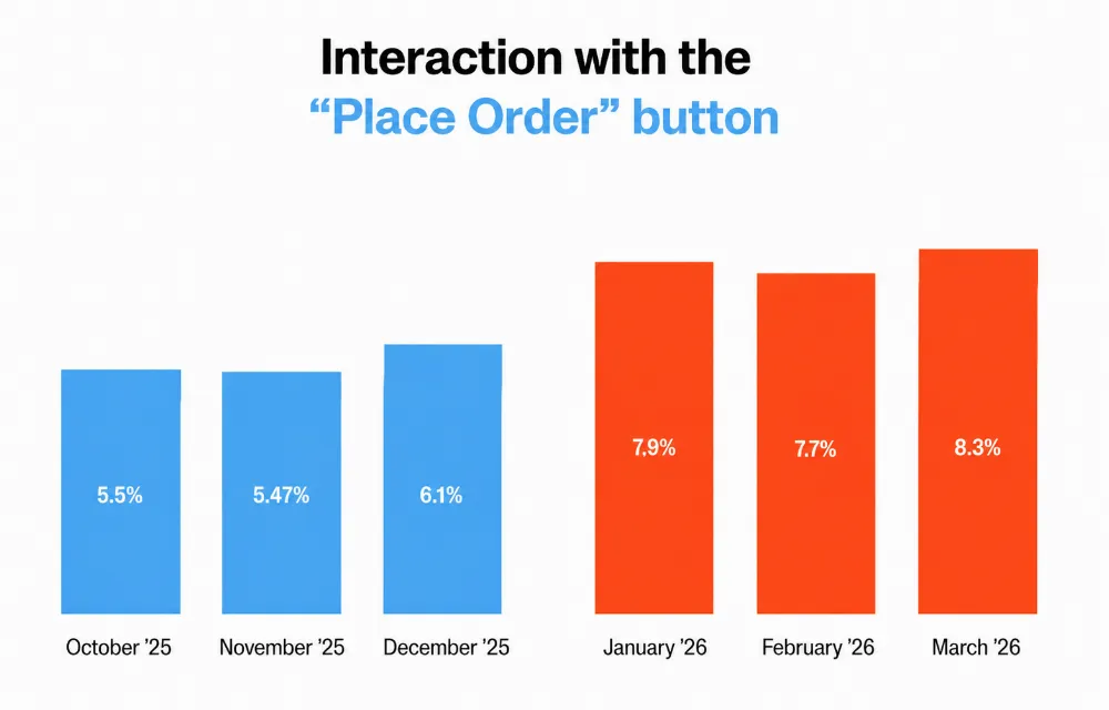
Cart CTA engagement rose 40%, from an average 5.7% to 7.97%.
-
The share of searchers who converted into buyers grew 150%, with search's overall contribution to site-wide conversion reaching 0.5% a month. A third of it directly attributable to the UI/UX tweaks.
Optimization Process
Cart UX Optimization
The cart was previously a static review list, not a conversion step. Netpeak's shopping cart UX optimization focused on three changes:
-
Pinned the "Place order" CTA to the bottom of the screen so it stayed visible while browsing line items — this was the single biggest driver of the 40% lift in button interaction.
-
Added a "Continue shopping" button, which didn't exist before, giving undecided shoppers a way to keep browsing without abandoning their cart. About 1.3% of cart visitors now use it monthly.
-
Tested a quick "add to cart" icon on the recommendations block. It underperformed at 0.03% CTR, showing that upsell UI needs its own validation rather than an assumption that more surface area equals more revenue.
P.S. Beyond the primary tests, we've introduced several UX enhancements for this fashion case study: live stock counts, estimated delivery dates, real-time quantity-based pricing, and a simplified footer. Although these changes weren't measured independently, they reduced cognitive load and made the purchase journey easier to navigate.
Checkout UX Optimization
Checkout UX carries the highest stakes of any step: a confused shopper here doesn't reconsider, they exit. The redesign addressed three friction points:
-
Sticky confirm-order button, so the CTA never dropped out of view during form completion — this pushed confirmation conversion from 11.6% to 20.9% (+80.6%).
-
Fixed order total, kept visible throughout so shoppers always know the final price before confirming.
-
Clearer microcopy and cashback framing, including the exact cashback amount in local currency, which reduced reliance on cash-on-delivery by about 10.7% as trust in the online payment flow increased.
Every unnecessary element is another chance for a shopper to leave. Removing the newsletter signup and simplifying the header and footer kept the checkout focused on one goal: completing the purchase. That's especially important when 18% of shoppers abandon their cart because the checkout took too long.
Search UX Case Study
A 20,000+ SKU catalog creates both opportunity and friction: shoppers have more choices, but finding the right product becomes a hassle. With users browsing 16 products and 53 categories per session on average, improving search became a key priority for this UX project. The team tested five hypotheses:
-
Popular category tags shown immediately on search open, for shoppers without a specific query.
-
Saved search history, aimed at the repeat-purchase behavior typical of a wholesale buyer base.
-
A "Top Sellers" module inside the search experience, surfacing high-demand products directly.
-
A "View all top products" button, giving a one-click path to the full best-seller list.
-
A recovery path for zero-result searches with a prompt plus a "Browse catalog" button instead of a dead end.
Every hypothesis moved the needle in the same direction. Search's contribution to purchase conversion rose 7.58% in January and 8.54% in February, and the share of searchers who converted into buyers grew 150% within the first month.
Key Takeaways & Lessons Learned
The Trofomiv Family ecommerce clothing UX case study has proved a few basic truth UI/UX & CRO optimization in practice:
-
Visibility beats novelty. A pinned CTA outperformed every other single change across cart and checkout, so, before adding features, make sure the existing ones can't be missed.
-
Transparency reduces hesitation. Showing the order total and cashback amount clearly did more to build trust than any trust badge or reassurance copy alone.
-
Not every hypothesis should ship. The cross-sell "add to cart" icon tested at 0.03% CTR — a useful reminder that UX decisions need data, not just intuition.
-
Search is a conversion channel, not a utility. For a large catalog with repeat buyers, small search improvements compounded into a 150% lift in searcher-to-buyer conversion.
-
Simplification is a feature. Removing secondary content from checkout and cart headers/footers consistently supported the primary action rather than distracted from it.
Where to Go From Here
Cart, checkout, and search are among the fastest areas to audit on any website built for a fashion brand, since the fixes are interface-level and don't require a platform migration. A structured UX audit for fashion ecommerce sites is the fastest way to find which funnel steps are quietly losing conversion, and a full UX/UI design for clothing brands engagement is where those findings become a rebuilt, tested interface.

 0
0
 0
0
 0
0
 0
0
Related Articles
Amazon's AI Now Builds Complete Looks on Product Pages. How Do Brands Make Sure the Bundle Is Theirs?
Amazon now uses AI to assemble complete, shoppable looks around a single product, and it fills those looks with whichever brands its model picks.
Pet Food Product Patent: How to Protect Your Innovation
Patenting pet products requires careful consideration and proper application filing. With the 8 steps below, you will be able to submit your patent application and protect your invention.
What Happens When Amazon Suppresses Your Listing? The New 2026 Rules
Under the new 2026 rules, Amazon warns you first and gives you a grace period to fix the issue.