Foundation Received 34 Improvement Points and a Projected 10% Increase in Completed Orders Through UX Audit

Foundation Case Study
Coffee lovers found Foundation, the online store sells coffee and brewing equipment, but too many left empty-handed. Somewhere between the first search and the final order, users were abandoning the site. They brought in Netpeak to pinpoint where the journey broke down and what to fix first.
Contact us

Project objectives:

Identify the UX issues stopping users from finding products and placing orders
Analyze the key stages of the user journey and find growth points to improve conversion

Results

34
UX hypotheses and recommendations prepared
10%
projected increase in completed orders

Services Delivered:

Industry:

Project Timeline

May – June 2025

Users Were Leaving the Site at Every Key Step Before Purchase

Foundation’s website gives shoppers several ways to find the right coffee: filters, search, promotional banners and a grind selection window. However, each one was also a place to lose them. 32.75% of visitors left when filtering returned nothing and up to 70% when a search came back empty. Another 13.33% closed the grind selection window without choosing, and by checkout only 26.79% of users started filling in their details.
The company partnered with Netpeak for a comprehensive UX audit built on Google Analytics 4 data, session recordings and user scenarios: a structured process that could show where the journey was breaking down and turn it into a clear improvement plan.

Cooperation Goal:

Find the problem points in the user journey and the growth points for conversion.

Our Strategy

One purchase journey, many exit points: the starting point was finding where users were lost at each stage and why.

Start with user behavior

Google Analytics 4 data and Microsoft Clarity recordings showed how users move through the site and where they get stuck.

Break the journey into stages

Search, catalog, product pages and checkout were analyzed separately to find the barriers at each stage.

Check the main product selection scenarios

The analysis revealed the problems that made it harder to find the right product and decide to buy.

Turn findings into a prioritized plan

34 UX hypotheses and recommendations, ranked by potential impact on conversion and by implementation complexity.

Improving Search to Help Users Find Products Faster

The search didn’t forgive typos and could return an empty page even when the right product was in the catalog. Up to 70% of users left in that scenario, a clear signal that search needed to offer another way to reach the products.
Recommended adding popular queries and categories when search opens, so users can jump straight to the right section without typing anything.
Pitched a search history to let users return to earlier queries without retyping them.
Laid out a reworked no-results screen that offers alternative search options and a way into the catalog, which keeps the journey going.

Streamlining Checkout to Get More Users to Start Their Order

Only 26.79% of users started filling in their details at checkout. The likely cause was an overloaded first screen: too many options and distractions, from the active menu to promo codes and profile links.
Suggested removing extra navigation from checkout with a minimized header or a clean checkout mode, keeping attention on completing the purchase.
Pointed to simplifying the first step: one main action and fewer elements competing for the user’s attention.
Put forward a progress indicator (“Step 1 of 3”) so users can see the sequence of steps and how many are left before the order is placed.

Turning Banners Into a Real Way In to Products

The banners weren’t working as an effective entry point to a purchase. A click opened only a pop-up with the same banner, with no link to a product page or promotion, which added a pointless step and weakened the advertising itself.

Recommended making banners clickable and sending users straight to the matching product, promotion or category page.

Suggested adding clear CTA buttons like “View Product” or “Buy” so users know the next step.
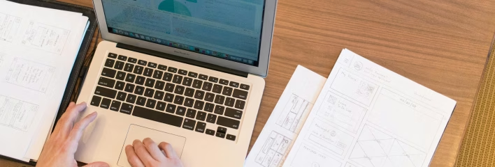
Proposed checking UTM tags and analytics events to track clicks and measure how well each banner performs.

Project Review

“There are very few companies on the market that deliver quality UI/UX audits, and by reviews and reputation, Netpeak is definitely the best of them. Unfortunately, there are plenty of self-proclaimed experts out there who only create the impression of expertise. The process was systematic and transparent: clear stages, assigned responsibilities, no reminders and no disputes, everything exactly to plan. I confidently recommend Netpeak as a partner for UX/UI and conversion growth.”
Roman Shakhov
CTO, Foundation
Our average time-to-proposal is  3 days
Request now!
Our average time-to-proposal is  3 days
Request now!

Get a Free Consultation on Your Project

Kateryna Holubka
Head of Sales of Netpeak International
Get a free consultation
Thank you, we'll circle back to you in 2 business days.
Oops! Something went wrong while submitting the form.