


Oops! Something went wrong while submitting the form.

Kateryna Holubka
Head of Sales of Netpeak International



Trofim Family's website was pulling in a large, active audience: users averaging 16 product views and 53 category views per session. The traffic was there, and so was the intent. But across three critical funnel stages, users were consistently dropping off before completing orders: a bare search field with no guidance, a cart CTA that could scroll out of view, and a checkout where unclear payment information and an unanchored confirm button were creating doubt at the last moment.
The company partnered with Netpeak to audit all three stages, develop targeted UX hypotheses, and measure the impact of every change.
Increase purchase conversions at every stage of the funnel (search, cart, and checkout) without increasing traffic or ad spend.


Start with the data: behavioral analytics, drop-off points, and user flow analysis to map where users were dropping off and what the numbers looked like before any changes.

Work stage by stage: search, then cart, then checkout, each treated as a separate conversion problem with its own hypotheses and success criteria.

Measure everything: no change went live without a pre-defined metric to validate it against, so every result could be attributed to a specific decision.
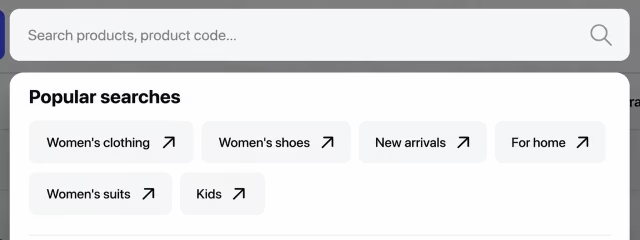
Added popular category tags that appear the moment a user opens search, giving them a direct path to key categories without typing (plus a "Top Sales" block showing high-demand items to users without specific queries).
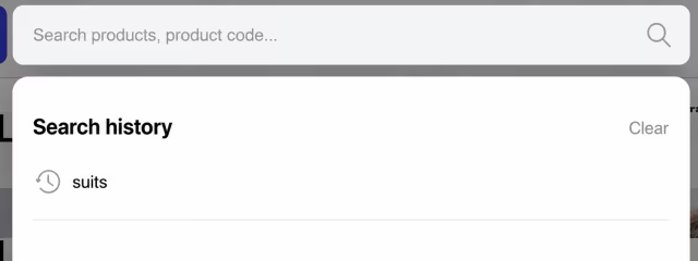
Enabled search history so repeat buyers could return to previous queries instantly, removing a step that a B2B audience placing regular, often identical orders had to repeat every time.
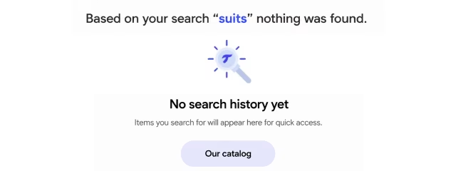
Replaced the dead-end "no results" screen with a "Our Catalog" button, keeping users in the funnel instead of sending them to the exit.

Made the "Proceed to Checkout" button sticky so the primary CTA stayed visible throughout cart review; no scrolling, no losing the action

Added a "Continue Shopping" button for users not ready to commit, giving them an explicit path back to the catalog rather than a dead end

Removed the "Stay Updated on News" block, simplified the header and footer, and added real-time price updates, expected delivery dates, and live stock availability
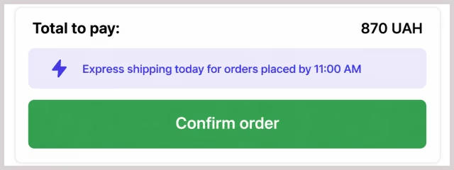
Made the "Confirm Order" button sticky and anchored the final order amount to the screen, so both stayed visible throughout form completion
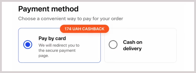
Rewrote payment microcopy and clarified cashback amounts in UAH; short, direct reassurance phrases that answered the questions users were silently asking
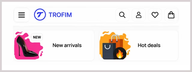
Stripped secondary content from the checkout header and footer, removing anything that could pull attention away from completing the order