
Micro UX is small funny elements of websites, interactive atoms of website design. Their main target is the stimulation of user's good emotions. They inform, give additional value or some fun. But what is the point? The solutions of micro UX always express care about their visitors. Сare on the level of the smallest details. It's nice when this care is provided by ecommerce websites.
A minute of theory
The unique user experience is available when we exactly imagine why a customer will use this product. Also users appreciate pleasant details of usability and elements of interface (micro UX). Most of the ecommercers are focusing on the macro UX items. That's about project development details or new product promotion. The micro UX approaches could provide emotional coherence between the project and web-design features as even small things like a buy button color affect ecommerce CTR. Lately the micro UX is becoming more and more popular. More detailed information about the difference between macro and micro UX you can find in the book "How to Design Experiences: Macro UX versus Micro UX Approach".
|
Criteria |
Мacro UX |
Micro UX |
|
UX approach |
Creating a big picture of UX and deriving product concepts |
Proposing UX improvement and avoiding UX violation in detail |
|
User goals |
Be-goals (why user wants it) |
Motor-goals (how user uses it) |
|
Starting point |
Predefined set of user needs |
Existing product design |
|
Result |
Effective UX |
Efficient UX |
|
Influence |
Product concept and functions |
Product embodiment design |
|
Development phase |
Early stage of goal setting |
Embodiment design, optimization |
|
Time span |
Long-term: consideration during whole design process necessary |
Short-term: occasional support during seeral stages possible |
Hover effects
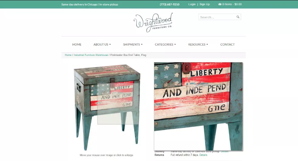
Among hover effects on a site of vintage furniture WrightWood, a "magnifying glass" worthes attention. It allows to see details of all models in a split screen. To magnificate a fragment it's enough to hover a cursor over it.
The product in action
Dancing points of menu of the American Apparel website are advertising a new shoes collection. Steal this idea, especially if you do UX for a clothing brand.

Find out what is inside
Pencil 53 is stylus for Ipad in a wooden cover. During vertical scroll the stylus can be disassembled and assembled again. 
The power of inertia
The product pictures on the Apple website still move up or down after user stopped scrolling. It looks like the pictures adapt to the features of user's monitor.

The other side of the medal
The guys from SohoFixed update and sale retro bikes. They decided to use only photos on the main page without any excessive text. There are only photos the unique two-wheel mechanisms. While a cursor hovers over a specific model the picture flips and user can see more details.

Day and night
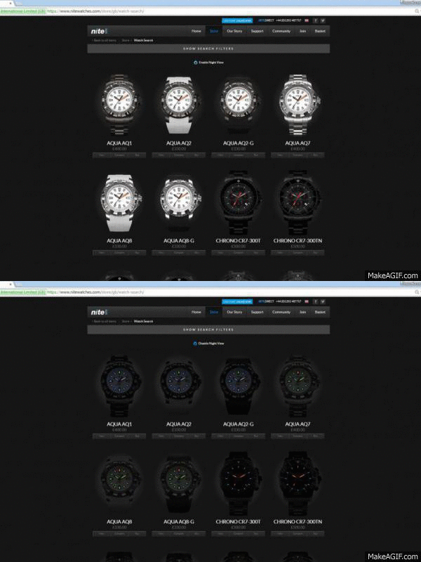
The watch brand from Britain, Nite, has a tritium backlight feature. It's more common in military equipment. To see how the watch looks at night you can press the "Enable Night View" button.
"Hungry basket"
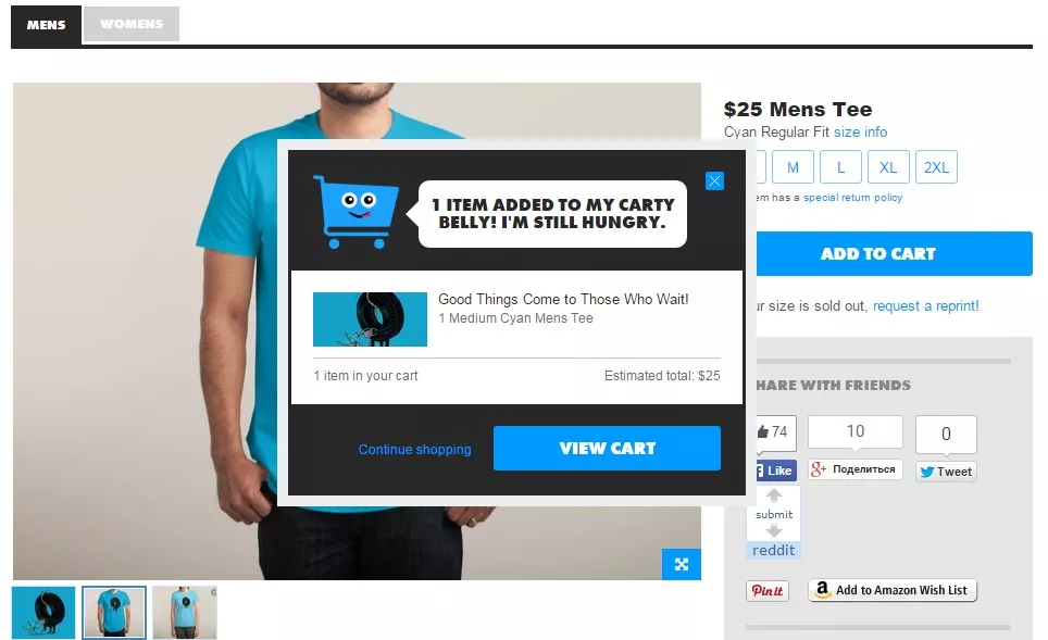
The creators of ThreadLess site displaced micro UX element to the last step of sales funnel. After adding the first purchase to a basket, this animated basket is asking more.
Care about details
Finally here is an interesting example in a mobile ecommerce. Virgin America airline (Alaska Airlines since 2017) tickets booking shows us great examples for mobile sites. During registration user recieves couple of pleasant compliments automatically.

While booking your seat you can choose an individual avatar and at the same time appreciate your future neighbors' sense of humor.


 4
4
 0
0
 0
0
 4
4
Related Articles
Business Apps in the US: iOS vs. Android, September 2026
We searched for US App Store and Google Play data to see what business apps professionals, shoppers, and investors actually installed in September.
What Happens When Amazon Suppresses Your Listing? The New 2026 Rules
Under the new 2026 rules, Amazon warns you first and gives you a grace period to fix the issue.
Business Apps in the US: iOS vs. Android, August 2026
We’ve fetched data from the US App Store and Google Play to see what professionals, shoppers, and businesses are actually installing, and why the market leaders are winning right now.