
Ecommerce Case Study: How UX Mistakes Made a Site Bleed Customers
This ecommerce UX case study for an online coffee retailer shows how a few thoughtful design fixes that don't take up a lot of resources or time can significantly boost conversion rates.
Working with Foundation, an online retailer of coffee, tea, and brewing accessories, Netpeak's UX team audited the shopping experience and identified fixes across four critical ecommerce touchpoints: site search, product filtering, homepage banners, and the checkout flow.
We developed hypotheses about the website's user experience that showed significant potential for improvement:
-
+7–10% increase in completed checkouts, from a simplified, distraction-free checkout flow
-
+10–15% growth in search-to-conversion rate, from typo-tolerant, fuzzy search results
-
-20–25% reduction in catalog exit rate, from dynamic filters and smart product recommendations
-
+15% increase in banner click-through rate, from making banners directly clickable
Read on for actionable insights for brands looking to improve their conversion rates and eliminate barriers that cause users to leave their site without converting.
Ecommerce Case Study Overview
Client: Foundation — online retailer of coffee, tea, and brewing accessories. They are a premium niche brand with clear brand identity and mass-premium ambitions that serve B2B clients, offer franchises, and distribute through more than 100 European locations.
Service: UX Audit
Timeline: May–June 2025
Scope: Site search, product filtering, homepage banners, checkout flow
Netpeak Project Team: Valeria Ivanova, UX Specialist; Danilo Minin, Head of CRO & UX/UI Design; Denis Gaienko, Client Project Manager.
|
Area |
Baseline |
Identified Friction |
Projected Lift |
|
Checkout initiation rate |
26.79% start checkout |
Cluttered first screen, no progress indicator |
+7–10% completed orders |
|
Search-to-conversion |
Up to 70% exit on zero results |
No typo tolerance, no fallback results |
+10–15% |
|
Catalog exit rate (filters) |
32.75% exit on empty filter results |
No dynamic filtering or fallback matches |
-20–25% |
|
Banner CTR |
Banner click reopens same banner as pop-up |
No direct link to product/promo |
+15% |
|
Grind-selection pop-up abandonment |
13.33% close without selecting; ~50% leave after interacting |
Unexpected mandatory step post-"Add to Cart" |
Reduced cart abandonment (not separately quantified) |
Challenges & Goals
Foundation had a distinctive identity and a product people wanted, but they needed to know why that wasn't consistently translating into checkouts. They came to us for a professional UX design audit to understand what was standing between visitors and completed purchases.
The UX for ecommerce goal wasn't just to identify issues. It was to produce an evidence-backed set of hypotheses that would make the shopping experience faster, more intuitive, and, fittingly for a coffee brand, more "flavorful" for the people using it.
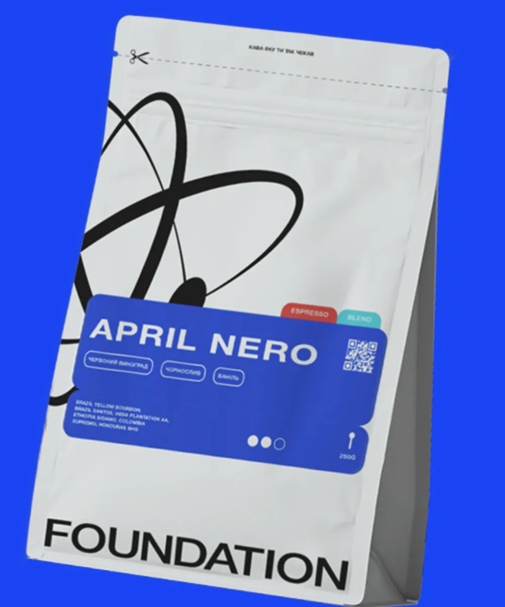
The client's challenge: Foundation needed to identify where, specifically, in the path from browsing to checkout users were dropping off, and why. Was it a discovery problem (can't find the product), a decision problem (too much friction choosing options), or a checkout problem (too many distractions at the final step)?
Results
The audit found both clear and less visible friction points, all supported by behavioral data:
|
Area |
The Problem |
Impact |
|
Filters |
Dead-end filter combinations returned a generic "no results found" message |
~32.75% of visitors who hit this left the site |
|
Search |
No tolerance for typos; exact-match only |
Up to 70% of users left after a zero-result search |
|
Banners |
Clicking a homepage banner opened a pop-up of the same banner instead of the linked product/promo |
Wasted clicks, broken funnel tracking |
|
Grind selection |
A mandatory pop-up forced grind selection immediately after "Add to Cart" |
13.33% closed it without choosing; ~50% abandoned the page after interacting with it |
|
Checkout initiation |
Only 26.79% of users who reached checkout actually started it (city/address entry) |
Roughly 1 in 4 shoppers even attempted the first step |
Projected impact of fixing these issues:
-
Catalog exit rate: down 20–25%, from dynamic filters and "try these instead" recommendations
-
Search-to-conversion rate: up 10–15%, from typo tolerance and relevant fallback results
-
Banner CTR: up at least 15%, from making banners directly clickable
-
Completed orders: up 7–10%, from a simplified, less cluttered checkout flow
Here's what our client had to say about the results of working with us:
"There aren't many companies that deliver quality UX audit services. Netpeak is genuinely among the best in terms of reputation and results — especially at a time when there's no shortage of people who just look like experts.
The process was systematic and transparent: clear stages, clear ownership, no back-and-forth. I'd confidently recommend Netpeak as a partner for UX/UI and conversion optimization."
Roman Shakhov, CTO, Foundation
Identified Ecommerce UX Issues and Hypotheses
Our research helped us find both clear and hidden barriers in the user experience. We combined four methods to build a complete picture:
-
Behavioral analytics — analyzed Google Analytics and Microsoft Clarity data to find high-exit pages and repeated back-and-forth behavior during checkout, and to see which categories and products got the most attention (and where users got stuck).
-
Usability test — followed the complete buyer journey, from finding a product to making a payment. We looked at how easy it was to navigate the website, use filters, find important information, and complete a purchase through the cart and checkout.
-
Competitive analysis — compared Foundation against direct competitors and international ecommerce leaders in the coffee space, identifying practices from the competitive edge that could be adapted without diluting the brand's identity.
-
Mobile experience review — given that a significant share of traffic came from phones, we specifically tested how easy it was to find a product and complete an order on a small screen.
Filters
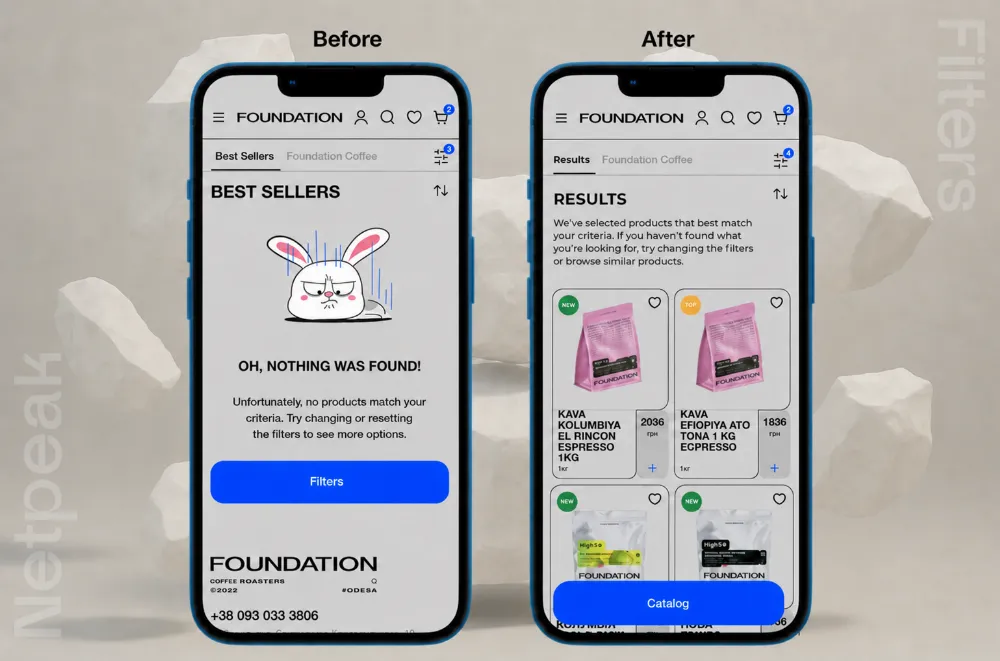
If the filters didn’t return any results, the user saw a “nothing found” message. This created a barrier to interaction: approximately 32.75% of visitors left the Foundation website in such cases.
Hypotheses:
-
To fix the dynamic filters — to hide or disable parameters that yield no results.
-
To add a “Try changing your filters” recommendation block with options for similar results.
-
To provide a fallback online shopping scenario — to display products with partial matches (e.g., a different volume) in the information architecture.
Search
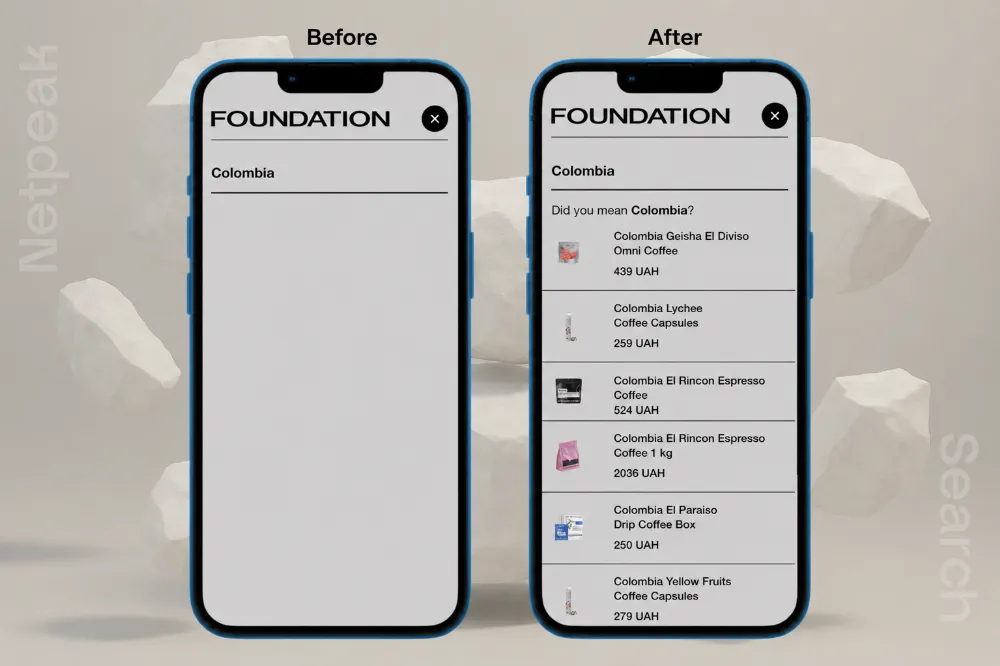
The search did not account for typos and returned no results even when the product was available. Up to 70% of users left the site if they saw zero results.
Hypotheses:
-
To implement “tolerant” search (fuzzy search) that accounts for typos and synonyms.
-
To add suggestions such as “Did you mean…?”
-
If there are no exact matches, display relevant categories or popular products.
-
Optionally, integrate autocomplete based on popular search queries.
Banners
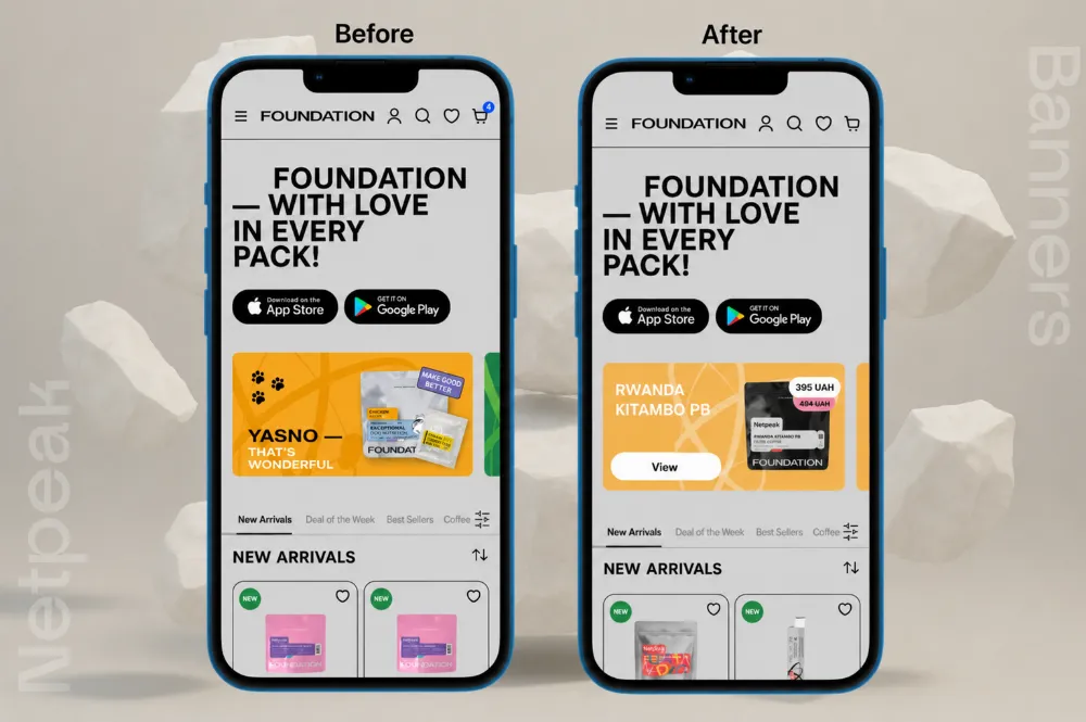
When users clicked a banner, they didn’t land on the product or promotion page. Instead, the same banner simply opened in a pop-up. This added an unnecessary step and made the banner less effective.
Hypotheses:
-
To make banners clickable — to link directly to the product, promotion, or category.
-
To add prominent CTA buttons — “View Product,” “Learn More,” “Buy”.
-
To verify the accuracy of UTM tags and events in analytics to track clicks.
Coffee Grind Selection
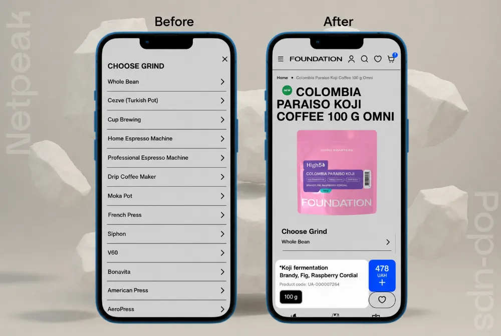
After clicking “Add to Cart,” users had to choose a grind in a pop-up before they could continue. 13.33% closed the pop-up without choosing an option, and nearly 50% left the page after interacting with it.
This suggests that the extra, unexpected step made the purchase process feel more complicated.
Hypotheses:
-
To integrate the grind selection directly into the product card.
-
To save the user’s last selection for future purchases.
Checkout
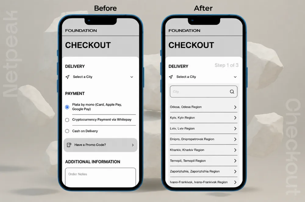
Only 26.79% of users began the checkout process. In fact, only one in four took the first step by selecting a city or entering their information.
Possible causes include an overloaded first screen, an excess of options, and distracting elements (active menu, promo codes, profile links).
Hypotheses:
-
To remove unnecessary navigation from the checkout — use a minimized header or a “clean” checkout layout.
-
To simplify the first step — leave only one main action.
-
To add a progress indicator (“Step 1 of 3”) to give users a sense of the process nearing completion.
AI technologies offer more checkout options. Read our article about the Instant Checkout ChatGPT feature to learn more.
Every ecommerce niche has its own quirks — and coffee is only one part of the story. If you’re also interested in more ecommerce expert tips, explore these practical guides:
-
10 E-Commerce Personalization Strategies (Step-by-Step Guides & Cases Included)
-
PPC for E-commerce: How to Buy Attention Without Going Broke
-
How to Do SEO for E-Commerce Websites to Only Reach Relevant Leads
-
9 Steps for How to Prepare Your E-Commerce Business for SEO Voice Search (Checklist Included)
Key Takeaways & Lessons Learned
-
Small friction points compound. None of these issues alone would sink a business, but a dead-end filter, a failed search, an unclickable banner with content, and a cluttered checkout stacked together add up to a majority of visitors never reaching payment.
-
Zero-result states are conversion killers. Showing users a "nothing found" is always worse than showing them something close. A fallback recommendation can recover a large share of otherwise-lost visitors.
-
Unexpected steps cost more than extra steps. Moving the same decision earlier, into a moment the customer expects it, removes the friction without removing the choice.
-
Checkout should have exactly one job. Every extra link, menu, or contact information on a checkout page is a chance for the customer to leave before paying. A focused, progress-indicated checkout consistently outperforms a feature-rich one.
-
A strong brand still needs a frictionless path to purchase. Foundation already had the harder half of the equation solved — brand identity and product quality. This audit was about making sure the ecommerce website was working as hard as the brand to convert that goodwill into completed orders.
What’s Next
The UX audit of the Foundation website revealed that even small details can significantly impact the user journey — from the first search query to clicking the “Pay” button. Optimizing filters, search, product cards, and checkout will make the purchasing process faster, more intuitive, and more enjoyable.
These are just some of the hypotheses we formulated during our research and competitor feature analysis. Next up: working on micro-interactions, emotional design, and post-purchase user retention. If you’re interested in UI design principles and how website redesign can affect user experience, read our case study for Zavezu.

 0
0
 0
0
 0
0
 0
0
Related Articles
Business Apps in the US: iOS vs. Android, September 2026
We searched for US App Store and Google Play data to see what business apps professionals, shoppers, and investors actually installed in September.
Pet Food Product Patent: How to Protect Your Innovation
Patenting pet products requires careful consideration and proper application filing. With the 8 steps below, you will be able to submit your patent application and protect your invention.
What Happens When Amazon Suppresses Your Listing? The New 2026 Rules
Under the new 2026 rules, Amazon warns you first and gives you a grace period to fix the issue.